E CSS in JS
This chapter discusses writing CSS in JS, a technique by which CSS styles and classes are defined in JavaScript rather than in separate CSS files. This technique is particularly common and useful in React, and solves a number of problems found in managing the styling of large web projects.
E.1 Why CSS in JS?
In November 2014, Facebook’s Christopher Chedeau gave a talk outlining many of the issues that occur when trying to develop CSS for a large application:
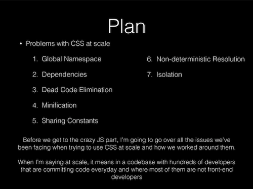
A slide from Chedeau’s talk. Click the image to view the entire deck.
In short, the talk points out how defining CSS classes in fact defines global variables: because stylesheets are loaded across the entire page, each class definition is effectively “global” and available to each Component within that page. If you define a class .button somewhere in your CSS, then every Component has access to the .button class.
This becomes a problem when you want to support many different components. For example, you couldn’t use
.buttonfor multiple buttons that are all styled very differently. Instead, you would need to define different classes for each button… and be careful to make sure that the names don’t “conflict” (e.g., you don’t try defining a.button-submitfor two different kinds of submit buttons!). You can use careful naming schemes (such as BEM) to make sure that your names don’t conflict, but this requires a lot of developer discipline and extra thinking—and one mistake can lead to difficult to track bugs!Moreover, CSS rules are global variables that include implicit details in their ordering (e.g., rules later in the stylesheet will override earlier ones). This is a problem when you’re trying to load lots of different style sheets for different Components—which may be loaded in different orders or even asynchronously so you don’t know which stylesheet will be loaded first!
The proposed solution to this problem is to define CSS style and class definition in JavaScript as JavaScript variables, and then using a library or build tool to convert those variables into properly name-spaced CSS classes that are included in the rendered DOM. This allow each Component to define its own styling (it’s just a JavaScript variable) without worrying about conflicting global variables.
- Although the CSS and JavaScript will no longer be quite as separated, in the end the code you write will be simpler and easier to intuit. However, the DOM that these techniques produce will often look a lot messier (e.g., in the developer tools), with more complex class names or vast amounts of inline styling. This is generally an acceptable trade-off: the DOM isn’t directly visible to most users, and is even ignored by screen readers.
Chedeau’s talk and its solution were hugely influential, marking a major shift in how web developers thought about CSS. It led to the creation of a large number of projects that provide a different ways of including CSS in JS. These libraries all do mostly the same thing, but use different syntax to solve the problem of making it easier to develop non-global CSS styles.
E.2 React Inline Styles
The easiest way to include CSS in JS using React is to use its built-in support for inline styling. You can define a CSS rule as a JavaScript object:
/* CSS version */
h1 {
  font-family: 'Helvetica';
  color: white;
  background-color: #333;
}
/* JavaScript version */
const h1Style = {
fontFamily: 'Helvetica',
color: 'white',
backgroundColor: '#333'
}This coincidentally requires only a few changes from how you would normally write CSS properties: you need to camelCase property names like when you refer to DOM styling (since - isn’t a legal character in JavaScript variables); you need to put all property values in quotes, and you use , instead of ; to separate properties in the object literal.
You can then apply this object to a particular element by specifying it as the style attribute using JSX:
<h1 style={h1Style}/>Hello World!</h1>This is not actually defining a rule (it won’t apply to all <h1> elements), but rather is using inline styling to apply the style to only a particular element.
Normally, in non-React contexts, inline styling (specifying CSS properties in an element’s style attribute) is considered bad practice. It is difficult to modify and maintain, and leads to code duplication and poor cohesion (with style rules spread out across the program). This is part of why CSS-in-JS is considered “special”: it takes what is usually bad practice and shows how, when used in a particular way (in React), it can actually produce better code!
You can even use JavaScript objects to namespace particular “style” objects, allowing you to produce something akin to CSS classes (where you can organize and apply lots of properties at once):
const styles = {
   success: {
      backgroundColor: 'green',
      color: 'white'
   },
   failure: {
      backgroundColor: 'red',
      color: 'white'
   }
}

//...
<button style={styles.success}>You win!</button>
<button style={styles.failure}>You lose.</button>
Note that these aren’t real CSS classes, but rather are simply names given to styles that are applied inline. Thus you wouldn’t refer to this button as .success (or even .style.success)—it is just a classless button that has some styles applied!
E.3 Aphrodite
React inline styles allow you to specify styling without creating global variables, but don’t provide actual CSS classes. This means that you lose some semantic meaning (since you can’t determine e.g., if a button is a “success” button just from the rendered DOM). You also lose the ability to handle more complex CSS rules, such as pseudo-classes (particularly ones like :hover or :active) and media queries.
For these features, you instead will need to use a third-party library for support CSS-in-JS. There are a wide variety of options for libraries that can be used for author robust CSS-in-JS. One of the cleanest (in the author’s opinion) of these libraries is Aphrodite, which is developed and maintained by developers at Khan Academy. This library allows you to specify CSS classes as JavaScript objects, and then apply those classes to a React element via the className attribute as normal.
You specify a collection of style classes by using the StyleSheet.create() method supplied by the library. This method is passed an object whose keys are the “class names”, similar to in the example above. You then reference the “classes” from this object by using the library’s css() function:
import { StyleSheet, css } from 'aphrodite';

const styles = StyleSheet.create({
    success: {
       backgroundColor: 'green',
       color: 'white'
    },
    failure: {
       backgroundColor: 'red',
       color: 'white'
   }
});

//...
<button className={css(styles.success)}>You win!</button>
<button className={css(styles.failure)}>You lose.</button>
- Note that classes are still name-spaced (e.g.,
styles.success, not justsuccess), you you pass the result of thecss()function to theclassNameproperty.
The Aphrodite library will take this StyleSheet you have defined and use it to automatically generate CSS class rules which are injected into the page, just as if you had to written them inside of a .css file! The above JSX code will produce DOM elements:
<button class="success_c72tod">You win!</button>
<button class="failure_cioc8l">You lose.</button>
Note that the class names start with the name you gave it, but have a number of additional characters at the end (the _c72tod after success). These characters are a hash of the CSS properties contained within that classname, and are used to distinguish between different classes after they have been injected into the page and thus have become “global” variables. In effect, this library will automatically produce “unique names” for each CSS class you define (differentiated by a deterministic hash at the end), so you don’t need to worry about the success class in one Component interfering with the success class in another.
Aphrodite will also let you specify pseudo-selectors and media queries. These are specified as properties of the classes they should apply to; the name of that property is (a string of) the pseudo-selector or media query, and the value of that property is another object containing the CSS properties to apply:
const styles = StyleSheet.create({
    //...
    hover: {
        ':hover': {
            backgroundColor:'gray'
        }
    },
    responsive: {
        '@media (min-width:598px)': {
            fontSize:'2rem'
        }
    }
});- This is different from how you normally define media queries: rather than specifying a media query with a block containing the classes it should apply, you specify a class whose block contains the media query.
You can pass multiple style classes (or arrays of classes) into the css() method, and they will automatically be combined into a single unique style:
//pass multiple styles into `css()`
<button className={css(styles.success, styles.hover)}/>You win!</button>
This will render an element with the DOM:
<button class="success_c72tod-o_O-hover_2nsohz">You win!</button>Note here that the success and hover classes have been concatenated into a single class (using -o_O- as a separator); this is to avoid any “ordering” issues—ensuring that the hover options are always applied after the success options.
Aphrodite supports a few other features and edge cases, see the documentation for details.
Aphrodite is just one of many different CSS-in-JS libraries, all of which have their own syntax. But almost all of them will either generate an inline style to inject into an element, or will produce their own injected stylesheet with auto-generated class names. In either case, you can focus on just styling the components without worrying about the CSS stepping on its own toes!
E.4 CSS Modules
Another popular approach to solving the “global scoping” problem with CSS is to utilize CSS Modules. Rather than converting JavaScript objects into CSS styles and injecting them into the page, with CSS Modules you write your class definitions in .css files as normal. The CSS Modules then post-processes the .css files at build time (similar to how SASS works), converting the CSS classes into locally scoped versions. These locally scoped classes are then imported as JavaScript objects so that they can be referenced in a manner similar to React Inline Styles:
/* app-styles.css */
.success {
   background-color: green;
   color: white;
}

.failure {
   background-color: red;
   color: white;
}
/* App.js */
import styles from './app-styles.css'
//...
<button className={styles.success}>You win!</button>
<button className={styles.failure}>You lose.</button>This will render DOM elements with unique, locally-scoped class names (similar to what Aphrodite does):
<button class="src-___App__success___1t37A">You win!</button>
<button class="src-___App__failure___2BnXi">You lose.</button>
Overall, CSS Modules has the advantages of letting you write styles in .css files as usual (it’s clear where your CSS is located), can run slightly faster (since in the end, it’s just a CSS file loaded as normal), and include a few extra features that supports easy composition of classes (similar to that provided by SASS).
Ejecting from Create React App
CSS Modules is a post-processor that “compiles” your CSS at build time, rather than at run time. Thus in order to utilize CSS Modules, you need to configure your application’s “build system” to modularize the CSS. So far, you’ve utilized Create React App to provide a no-configuration build system (using webpack behind the scenes). However, Create React App doesn’t support CSS modules by default—you need to modify the provided Webpack system to include the modularization step.
In order to modify the Webpack configuration build into Create React App, you will need to eject it. This process will change your project so that the Webpack configuration files are included as part of the source code, rather than loaded from a a single external library (react-scripts). Ejecting will allow you to modify how your React projects are built.
Ejecting is a one-way operation! Once you have “extracted” the build configurations, it’s impossible to put them back (short of creating a new app and copying the files over). Be sure you want to do this! Note that if you really don’t want to eject, there are other, more fragile solutions.
In order to eject your configuration information, run the following command:
cd path/to/app  # from the app folder
npm run eject
This will create two new folders in your project: scripts (which contains the build and start scripts, e.g., what happens when you run npm start), and config/ (which contains the build configuration files).
- The Webpack configuration files specifically can be found at
config/webpack.config.dev.js(configuration for the development server) andconfig/webpack.config.prod.js(configuration for production builds). In order to support CSS Modules, you will need to modify both the development and production configuration files.
You will need to make a simple change to the Webpack configuration files to support CSS Modules. In the webpack.config.dev.js file, at around line 160 (as of this writing), you will find a “rule” object with the property test: /\.css$/; this specifies what processing should be applied to .css files. Modify this property:
{
  test: /\.css$/,
  use: [
    require.resolve('style-loader'),
    {
      loader: require.resolve('css-loader'),
      options: {
        importLoaders: 1,
        //ADD THE BELOW TWO PROPERTIES!!
        modules: true,
        localIdentName: '[path]___[name]__[local]___[hash:base64:5]',
      },
    },
    //...
}
These changes modify the already included
css-loaderloader so that it supports CSS Modules (a feature that is built into the loader, but not enabled by Create React App by default). The second line specify the “pattern” that should be used for generating the compiled class names: in this case, each class is named with the file path where it is used (imported), as well as its imported name.For
webpack.config.prod.js, add the samemodules: trueproperty to the object dealing with'css-loader'(around line 180 as of this writing). You should not specify a customlocalIdentName, since the default is a shorter hash that will run faster in production (though be less readable).
This is the only change you need to make to utilize CSS Modules! Now you can import CSS files into your React components as illustrated above, referring to each class as a property of the imported object which can be assigned to an element’s className attribute!
- Note that if you want to apply multiple classes to an element, it’s often easiest to utilize the
classnamespackage, which gives you a helper method calledclassNamesthat will easily concatenate different classnames for you. See the examples for details.
react-css-modules
If needing to refer to classes as style.classname is tedious, you can use the react-css-modules library to simplify your React code. This library allows you to “decorate” each component with extra functionality—in particular, it allows you to use a styleName attribute to specify classes directly, without needing to namespace them:
import CSSModules from 'react-css-modules';
import styles from './app-styles.css';

class App extends Component {
    render() {
        return (
            <div>
                {/* Note the lack of `styles` namespaces! */}
                <button styleName={success}>You win!</button>
                <button styleName={failure}>You lose.</button>
            </div>
        );
    }
}

export default CSSModules(App, styles); //decorate the App so it reads from the styles
It is also possible to automate this decorating by using babel-plugin-react-css-modules, which is a webpack plugin that will automatically process the styleName attributes in the JSX at build time (e.g., it changes how the JSX is compiled!). This provides a significant performance benefit (as well as making your code cleaner).
In order to support
babel-plugin-react-css-modules, install the library withnpmand modify the Webpack config file. Modify the “rule” object with the propertytest: /\.(js|jsx|mjs)$/(which applies to.jsfiles):{ test: /\.(js|jsx|mjs)$/, include: paths.appSrc, loader: require.resolve('babel-loader'), options: { cacheDirectory: true, //ADD THE BELOW PROPERTY!! plugins: [ 'react-css-modules' ] }, }This will apply the plugin whenever the JavaScript files are transpiled, allowing you to utilize the
styleNamewithout explicitly using thereact-css-moduleslibrary.Note that this plugin has a bug whereby changes to how CSS Modules are composed (see below) aren’t applied when the ejected Webpack’s developer server automatically reloads the browser window. See this issue.
Composing Classes
The other main feature of CSS Modules is the ability to compose classes—that is, you can specify that one CSS class contains all the properties defined by another. This is similar in functionality to the @extends keyword in SASS (though it only affects the classes as they are exported to JavaScript):
CSS classes are composed by specifying a composes property with a value that is the name of the class to “include”:
.base {
  font-family: 'Helvetica';
  font-size: 2rem;
}
.success {
  composes: base; /* include the .base properties */
  background-color: green; /* additional properties only for .success */
}
.failure {
  composes: base;
  background-color: red; /* additional properties only for .failure */
}
When applied to the previous example (the two <button> elements), this will render as two separate CSS classes:
<button class="src-___App__success___1t37A src-___App__base___LeFt5">You win!</button>
<button class="src-___App__failure___2BnXi src-___App__base___LeFt5">You win!</button>
While you can still specify just a single class in your JavaScript (e.g., className={style.success}), CSS Modules will automatically apply all of the “dependent” styles to your element!
Moreover, you can also compose CSS classes across separate files by specifying the value as coming from "filename":
/* colors.css */
.success {
    color: green;
}
/* app-styles.css */
.success {
composes: base;
composes: success from "../colors.css"; /* loads the color from another file */
}This makes it possible to break up your CSS classes into a large number of individual “helper” modules: for example, you could have a colors.css file that defines coloring schemes, a fonts.css file that defines classes that only handle fonts (e.g., .large), a layout.css file that defines classes that only handle layout (e.g., padding-small, margin-top-large), and so forth:
/* example from docs */
.element {
  composes: large from "./fonts.css";
  composes: dark-text from "./colors.css";
  composes: padding-all-medium from "./layout.css";
  composes: subtle-shadow from "./effect.css";
}
In effect, you can use different files you develop your own set of Bootstrap-style utility classes!
- This may seem like overkill for a small app, but can be a great help when you’re trying to design a large app (e.g., the size of Facebook) or a want to be able to consistently “theme” related but vastly different apps (think Gmail and Google Drive).
For more details and examples, see this tutorial introducing CSS Modules.
Resources
- React: CSS in JS - the talk pitching CSS in JS as an approach
- FAQ: Styling and CSS (React)
- Aphrodite documentation
- Inline CSS at Khan Academy - explanation and justification for the design choices used in Aphrodite.
- CSS Modules: Welcome to the Future - a step-by-step walk though and introduction