Chapter 7 CSS Properties
CSS Fundamentals introduced ths basic syntax and usage of CSS. This chapter provides additional details about some common appearance properties that can be modified with CSS.
This chapter is not intended to be a complete reference (use the MDN reference for that!), but rather to provide specific explanations and examples for styling pages with CSS.
7.1 Specifying Property Values
As described in CSS Fundamentals, properties are specified by the name of the property, followed by a colon (:), and ending with a semicolon (;):
p {
  /* A basic property */
  color: purple;
}
Values may be keywords specific to that property (including color names like purple), strings (in quotes), or numeric values (see Units & Sizes below). What values are valid options depends on the property; use the reference and examples like this chapter as a guide.
Some properties are written with multiple values, usually separated by a space (not a comma). For example, the border property described can be specified with 3 values: the first value is the width of the border, the second is the style, and the third is the color:
div {
  /* A property that has 3 values. They are separated by spaces */
  border: 3px dotted red;
}
Most (but not all) properties that have multiple values are actually shorthand properties—properties that allow you to specify multiple component properties at once. The above border property example is actually a shorthand for 3 different properties: the border-width, the border-style, and the border-color:
div {
  /* Border set as individual properties; equivalent to the previous example */
  border-width: 3px;
  border-style: dotted;
  border-color: red;
}
Shorthand properties often can be specified with a variable number of values, the number and order of which determines which component properties are indicated:
.all-sides-padding {
  /* Specify padding (spacing) on all 4 sides at once--top, right, bottom, left */
  padding: 1px 2px 3px 4px;
}

.x-and-y-sides-padding {
  /* Specify padding on top & bottom, then on left & right */
  padding: 10px 20px;
}
What options are available for a shorthand property depends on that property—use the documentation to check.
Including a shorthand property is interpreted as writing out all of the properties it replaces; so will replace any previous properties within the same rule (if the same property is declared multiple times, the “last” declaration is applied). Thus it is best to eitehr use just the shorthand property, or to specify each of the component properties explicitly.
body {
    border-color: red;
    border: 3px solid blue; /* later property override previous ones */
                            /* border will be blue instead of red */
}
Inherited Property Values
If you don’t explicitly set a property for an element, then the element will still be styled (it will still have a size, font, color, etc)—the value will be inherited from the parent element.
/* CSS */
ul { /* applies to all <ul> elements */
  font-size: larger;
}

li { /* applies to all <li> elements */
  color: red;
}
<!-- HTML -->
<ul>
<li>
This element's content will be in a larger font size (inherited from the
parent), as well as red (specified directly).
</li>
<li>(So will this element's content because the same rules apply)</li>
</ul>In the above example, the <li> elements will be in a larger font size even though a rule doesn’t specifically apply that property to them—the parent <ul> element gets that property value, and then the child <li> elements inherit it.
If the parent styling hasn’t been specified by you, then the element might still be inheriting a style! It will get these styles from the browser’s built-in stylesheet, often called the user-agent stylesheet. This is often the “default” styling that applies to elements, such as making headings big and bold. While most browsers have similar stylesheets, these can be adjusted and customized by the user (such as by making the “default font” size larger to help with accessibility). Thus sometimes you may need to explicitly style an element in order to override the browser’s built-in styling.
If you want to explicitly note that an element should be styled the same as its parent, you can give that property an inherit value. If you want to explicitly have an element be styled to the browser-default value, you can give that property an initial value. These are particularly useful when you want to “override” a more general rule to remove a specified styling.
h1 {
  /* color should be the same (inherited) from the parent element */
  color: inherit;

  /* font-size should use the browser-initial value */
  font-size: initial;
}
It’s important to note, however, that not all properties are inherited! For example, the border property is a non-inherited property; a child element will not gain its own border just because a border was specified for the parent. Most properties that style text or colors are inherited, while those properties that deal with size and layout are often non-inherited (it usually works the way you’d expect). You can check for any particular property by referring to its documentation.
Length Units & Sizes
Many CSS properties affect the size of things on the screen, whether this is the height of the text (the font-size) or the width of a box (the width). In CSS, you can use a variety of different units to specify sizes.
In general, CSS sizes are fundamentally measured in pixels (px). A pixel represents a single rasterable point of a display (it is not a tiny square), and is the usual unit used to measure display size. In the web a pixel is defined to be \(\frac{1}{96}\) of an inch; that may vary depending on the display size and resolution, but thinking of 100px as about an inch of screen space is a good starting heuristic. A pixel is an absolute length unit; a size specified in pixels is considered to always be the same size.
CSS does support a number of alternate absolute length units, including inches (1in = 96px), centimeters (1cm = 37.8px), millimeters, and points (\(\frac{1}{72}\) of an inch. 1pt = 1.33px; do not use this for font sizes). These however are generally inappropriate for computer displays and more useful e.g., in printing, so should not be used in styling web pages.
CSS also uses a variety of relative length units, which will produce sizes based on (relative to) the size of other elements. The most common relative units are described below.
em: Anemis measured relative to the parent element’s font-size:/* A parent element has a font-size of 16px */ .parent { font-size: 16px; } /* The child element would have a font-size of 32px */ .child { font-size: 2em; }If the parent’s font-size was
20px, then a font-size of2emfor the child would be valued at40px. This can be useful for indicating e.g., that you want an element’s font to be “twice as big”. Careful use ofem-based font-sizes also allow for effective scaling: you can change the font-size of a parent and then all of the children will resize accordingly.Note that although an
emwas originally a typographic measurement, this unit does not change based on thefont-family.An
emcan also be used for non-typographic properties such aswidth; in those situations the pixel value is calculated relative to the current element’s font-size.rem: Anremis measured relative to the root element’s (<html>element’s) font-size. Since most browsers have a default root font-size of16px, this generally means that2rem = 32px.Using
remunits can allow for relative scaling, but at a document-level rather than at an element-level. This can help keep things consistent; elememts won’t accidentally “balloon” in size because of increasingemmultipliers. But using relativeremunits rather than absolutepxunits allows your page to be more accessible (users can change the default font-size to be larger and more readable) and betters supports different browsers.%: A%value is measured relative to the parent element’s value for that property (font-size, width, etc). For example, if the parent element’swidthis300px, then an element with a width of50%would be150pxwide.For font-sizes, percentages act equivalent to
emunits. For example,.75emis the same as75%;2emis the same as200%. In general, its best practice to useemwhen sizing fonts to be consistent. Percentages can appropriate for dimensions such aswidthorheight.vw,vh: These units are relative to the viewport dimensions—the size of the browser window.1vwis 1% of the viewport’s width, and1vhis 1% of the viewport height ()25vwwould be 25% of the viewport width, etc). If the browser is resized, then these values will change. This can be a desired effect, but can also make it difficult to style a page that looks good across a wide range of browser sizes. Indeed, a regular%can achieve the a similar effect to avw.
Most browsers have a default font size of 16px, so 1em and 1rem will both be initially equivalent to 16px.
For length values of 0 (used e.g., for padding or margin), you omit the units as irredundant—you don’t need to say 0 of what. So you just use 0, not e.g., 0px.
In general, you should specify font sizes using relative units (e.g., em)—this will support accessibility, as vision-impaired users will be able to increase the default font-size of the browser and all your text will adjust appropriately. Absolute units are best for things that do not scale across devices (e.g., image sizes, or the maximum width of content). However, using relative sizes will allow those components to scale with the rest of the page.
Font-sizes should always be relative (em or rem); layout dimensions may be absolute (but relative units are best).
7.2 Fonts and Text
You specify the typographical “font” (the typefac) for text using the font-family property. This property takes a comma-separated list of font names (strings). The browser will attempt to render the text using the first font in the list; if that font isn’t available on the client computer, then it will use the next in the list and so on (you can then of these secondary fonts as “fall-backs”). Font family names are required to be put in quotes (single or double) if there is a whitespace in the name, such as with "Helvetica Neue". But it is good practice to put all font family names in quotes anyway—this makes it easier to modify if you change them to a font name with multiple words, and helps distinguish them from generic font names (see below).
p {
    font-family: 'Helvetica Neue', 'Helvetica', 'Arial', sans-serif;
}
In this example, the computer will attempt to render the text in 'Helvetica Neue'. If that font isn’t installed on the user’s computer, then it instead tries to use 'Helvetica', then 'Arial', and finally if none of those work will use a generic sans-serif font.
Indeed, the last font in the list should always be a generic family name. These are a list of “categories” that the browser can draw upon even if the computer doesn’t have any common fonts available. In pracice, the most common generic families used are serif (fonts with serifs, e.g., “Times”), sans-serif (fonts without serifs, e.g., “Arial”), and monospace (fonts with equal width characters, e.g., “Courier”).
Note that generic font families are not quoted: it’s sans-serif, not "sans-serif". If you put them in quotes, the the browser will intepret them as a family name and not as generic.
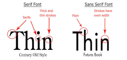
Serif vs. Sans-Serif fonts. From 99designs.ca.
Research (roughly) suggests that sans-serif fonts are easier to read on screens, as well as more accessible for users with e.g., dyslexia. Thus it is recommended to use sans-serif fonts for most text on your page.
It is also possible to include specific typefaces in your web page, which will be delivered to the browser by the web server in case the client doesn’t have the previously available. You do this manually by using the @font-face rule, and specifying the url for the font file (usually in .woff2 format).
However, it is usually easier to instead include a stylesheet that already has this rule in place. For example, the Google Fonts collection provides more than 800 different freely available fonts that you can include directly in your web page:
<head>
  <!-- ... -->

  <!-- load stylesheet with font first so it is available -->
  <link href="https://fonts.googleapis.com/css?family=Encode+Sans" rel="stylesheet">

  <!-- load stylesheet next -->
  <link href="css/style.css" rel="stylesheet">
</head>
body {
font-family: 'Encode Sans', sans-serif; /* can now use Encode Sans */
}
Notice that the <link> reference can be to an external file on a different domain! This is common practice when using fonts and CSS frameworks.
Important When using Google Fonts, you’ll need to specify if you also want variations such as bold or italic typesets. For example, the Encode Sans font is available in font weights (what you would set with font-weight) from 100 to 900, but you need to specify these in the linked resource:
<!-- includes normal (400) and bold (700) weights -->
<link href="https://fonts.googleapis.com/css?family=Encode+Sans:400,700" rel="stylesheet">
If you don’t include the different set of glyphs for the bolded font, then setting the text in that font to bold won’t have any effect (because the browser doesn’t now how to show text in “Bold Encode Sans”)!
Other font libraries can be used to add icons or symbols to a web page. For example, the Material Design icon font for the web lets you specify different icons by giving elements a particular class. Other icon-based fonts include Octicons and Font Awesome.
Emoji are defined using a different set of Unicode values, and are browser and operating-system dependent instead of being available through a font.
You can make a font italic using the font-style property, or bold using the font-weight property. Font weights are measured in different ordinal values ranging from 100 to 900. For most fonts these are specific values: there is no such thing as a font weight of 340 (only 300 and 400). Often using keywords for font weights (e.g., normal, bold, black) is easier to read and understand.
7.3 Colors and Backgrounds
Colors of CSS properties (foreground or background) can be specified in a few different ways.
You can use one of a list of 140 predefined color names:
p {
  color: mediumpurple;
  background-color: gold;
}
While this list does not offer a lot of flexibility, they can act as useful placeholders and starting points for design. The list of CSS color names also has a fascinating history.
Alternatively, you can specify a color as a “red-green-blue” (RGB) value. This is a way of representing additive color, or the color that results when the specified amount of red, green, and blue light are aimed at a white background. RGB values are the most common way of specifying color in computer programs.
p {
  color: rgb(147, 112, 219); /* medium purple */
}
This value option is actually a function that takes a couple of parameters representing the amount of red, green, and blue respectively. Each parameter ranges from 0 (none of that color) to 255 (that color at full). Thus rgb(255,0,0) is pure bright red, rgb(255,0,255) is full red and blue but no green (creating magenta), rgb(0,0,0) is black and rgb(255,255,255) is white.
Note that if you want to make the color somewhat transparent, you can also specify an alpha value using the rgba() function. This function takes a 4th parameter, which is a decimal value from 0 (fully transparent) to 1.0 (fully opaque). Elements with transparent colors will “blend” with any other elements behind them (which requires some non-standard positioning).
CSS also supports hsl() and hsla() functions for specifying color in terms of a hue, saturation, lightness color model.
Finally, and most commonly, you can specify the RGB value as a hexadecimal (base-16) number.
p {
  color: #9370db; /* medium purple */
}
In this format, the color starts with a #, the first two characters represent the red (ranging from 00 to FF, which is hex for 255), the second two characters represent the green, and the third two the blue:
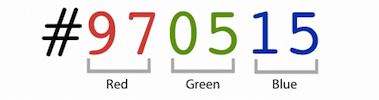
How to reading a hex value, from Smashing Magazine.
This is a more compact and efficient way to describe the RGB of a color, and is how most digital artists convey color. See this article for more details about encoding colors.
Backgrounds and Images
You have previously seen how to use the the background-color property to color the background of a particular element. CSS also supports a much wider list of background-related properties. For example, the background-image property will allow you to set an image as the background of an element:
header {
  background-image: url('../img/page-banner.png');
}
This property takes as a value a url() data type, which is written like a function whose parameter is a string with the URI of the resource to load. These URIs can be absolute (e.g., http://...), or relative to the location of the stylesheet (not to the web page!—you may need to use .. if your .css file is inside a css/ directory).
There are additional properties used to customize background images, including where it should positioned in the element (e.g., centered), how large the image should be, whether it should repeat, whether it should scroll with the page, etc.
header {
    background-image: url('../img/page-banner.png');
    background-position: center top; /* align to center top */
    background-size: cover; /* stretch so element is filled; preserves ratio (img may be cropped) */
    background-repeat: no-repeat; /* don't repeat */
    background-attachment: fixed; /* stay still when window scrolls */
    background-color: beige; /* can still have this for anything the image doesn't cover
                                (or for transparent images) */
}
This is a lot of properties! To understand all the options for their values, read through the documentation and examples for backgrounds.
To try and make things easer, CSS also includes a shorthand property called just background. Using this property, the above is equivalent to:
header {
    background: url('../img/page-banner.png') top center / cover no-repeat fixed beige;
}
Note that the background-position and background-size are separated by a / since they both can have more than one value. You can include some or all of the available background properties in the shorthand. Unlike most shorthand properties, the background properties can go in any order (though the above order is recommended).
Additionally, all of the background properties support multiple backgrounds by using a comma-separated list of values. This can enable you to easily overlay partially-transparent images on top of each other, similar to using layers in a photo-editing application such as Photoshop.
7.4 Spacing with the Box Model
The CSS Box Model is one of the core concepts in CSS, and is one of the central frameworks by which elements are visually presented on the page.
All HTML elements (including text!) include an imaginary “box” around their content. Elements are laid out with their boxes next to each other (side by side for inline elements, stacked on top for block elements—see Flow Layout). These boxes are normally just large enough to contain the content inside the element, but you can use CSS to alter the size of and spacing between these boxes in order to influence the layout.
First off, you can set the width and height of elements explicitly. Note that if the width or height are too small for the element’s content, then the content will be clipped by default (a behavior controlled by the overflow property). It’s generally best to set only the width or the height, but not both. You can also specify a min-width or min-height to ensure that the width or height is at least a particular size. Conversely, you can use max-width and max-height to constrain the size of the element. The width and height can only be adjusted for block elements (such as <p> or <div>); inline elements (such as <em> or <a>) are always sized to fit their content.
In order to adjust the spacing between boxes, you can manipulate one of 3 properties: the padding, the border, and the margin.
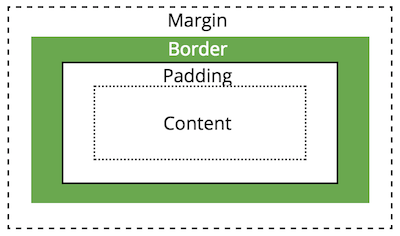
A diagram of the box model properties
These three properties can be seen in the Chrome Developer Tools when you select an element: the content is shaded in blue, the padding is shaded in green, the border is shown in its own color (or yellow), and the margin is shaded in orange.
Padding
The padding is the space between the content and the border (e.g., the edge of the box). If you think of the element’s content as being in a shipping box, then this is the “packing peanut” space around that content that is used to keep it from touching the boundaries of the box.
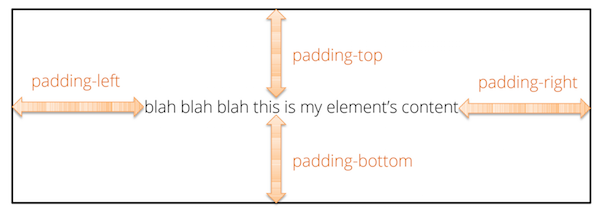
An element’s padding.
Padding can be specified for an individual side of the box individually using e.g., padding-top, or by using the padding shortcut property to specify multiple sides at once:
/* specify each side individually */
.individual-sides-padding {
  padding-top: 1em;
  padding-bottom: 1em;
  padding-left: 2em;
  padding-right: 0; /* no units needed on 0 */
}

/* specify one value for all sides at once */
.all-sides-padding {
  padding: 1.5em;
}

/* specify one value for top/bottom (first) and one for left/right (second) */
.x-and-y-sides-padding {
  padding: 1em 2em;
}
The padding is considered be “inside” of the element. Thus background styling (colors or images) will also apply to the padding area. Adding padding is a good way to increase the “size” of an element without needing to specify the width and height explicity.
Border
As noted above, the border (edge of the box) can be made visible and styled in terms of its width, color, and “style”. While thse can be set individually, it is most common to use the shorthand property to specify all three aspects at once.
.boxed {
   border: 2px dashed black; /* border on all sides */
}
Similar to with padding, you can specify the border on a specific side with properties such as border-top. In fact, you can specify each aspect of the border (width, color, style) individually for each side— the border property is actually a shorthand for 12 different properties!
.underlined {
   border-bottom: 1px solid red; /* border one side */
}

.individual-op-border { /* control border properties separately */
   border-top-width: 4px;
   border-top-color: blue;
   border-top-style: dotted;
}
Relatedly, the border-radius property can be used to “round” the corners of the box. The value specified is the radius of the rounded arc.
.rounded-rect {
  border-radius: 5px; /* rounded corners! */
}

.circle {
  border-radius: 50%; /* radius is half the width, so produces a circle */
}
Margin
Finally, the margin specifies the space between this box and other nearby boxes.
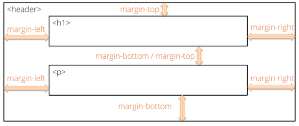
An element’s margins.
The margin is declared in an equivalent manner to padding, with similar individual and shorthand properties:
.individual-sides-margin {
  margin-top: 1em;
  margin-bottom: 1em;
  margin-left: 2em;
  margin-right: 0; /* no units needed on 0 */
}

/* specify one value for all sides at once */
.all-sides-margin {
  margin: 1.5em;
}
Note that browsers typically collapse (overlap) the margins of adjacent elements. For example, if you have two paragraphs on top of one another, and you set margin-bottom on the first and margin-top on the second, most browsers will overlap those margins and just use the larger of the two values to determine the spacing.
Padding vs. Margin
Padding and margin are both used to add space around content on the page—indeed, without a visible border or background color, adding either will achieve close to the same appearance! It can sometimes be challenging to decide which property to use when adding spacing between elements.
To help determine which to use, first remember that padding adds space inside the element, while margin adds space outside of it. If you want to make the element’s size larger—to have the border be further away or to have a larger background area, use padding. And if you want to put space between visible borders or visible background areas, use margin.
More challenging is when the boundaries between elements are not visible. In those situations I consider the semantics: am I adding spacing because I want this element to take up more space (padding), or because I want it to be kept further away from other elements (margin)? I often default to using padding when styling smaller or inline elements, and margin when styling block or section elements. But either can be appropriate; just be aware of choices if you end up needing to adjust the spacing later!
Box-Sizing
An element’s padding, border, and margin can be used to put space between element content on the page. However, when you assign an explicit width or height to an element, the dimension you specify does not include the padding or border when calculating the size of the element on the page! That is, if you have an element with the properties
.my-box {
    width: 100px;
    padding: 10px; /* includes both left and right */
}
The above element will take up 120px on the screen: the width plus the left and right padding.
This may seem intuitive, but can make sizing complex when including small adjustments such as borders. Indeed, when specifying more complex or responsive layouts, it’s often useful to have the width represent the entire width of the box, and not need to account for the border and padding separately in calculations. You can do this using the box-sizing property—a value of border-box will indicate that specified size of the box (e.g., the width) should include the size of the padding and border when determining the content area.
.my-better-box {
  box-sizing: border-box;
  width: 100px
  padding: 10px;
  border: 1px solid black;
}
The above element will take up 100px on the screen. This means that the content may be given a smaller space than anticipated, but it allows you to adjust the padding or border without worrying about changes to the overall element width.
It’s common to want to apply this property to all of the elements on the page, which you can do with the universal selector.
* {
    box-sizing: border-box; /* all elements include border and padding in size */
}
This is a good rule to include at the top of any .css file, and is often found in reset stylesheets.
7.5 Flow Layout
By default, HTML elements are are displayed on the page in a default layout called normal flow. This layout is determined by the order that HTML elements appear in the source code, and whether each element is a block element or an inline element.
As described in HTML Fundamentals, inline elements (e.g., <em>, <a>, <span>) are positioned next to each other on a single line (left to right, unless you specify a right-to-left language). Block elements (e.g., <p>, <ul>, <div>) are placed on subsequent “lines”, from top to bottom.
<div>Block element</div>
<div>Block element</div>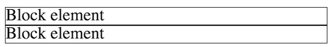
Example of block elements, placed on top of each other.
<span>Inline element</span>
<span>Other inline element</span>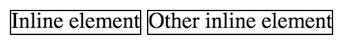
Example of inline elements, next to each other (even if the code is on separate lines).
It’s good practice to allow the browser to display elements using normal flow whenver you can. If the normal flow positioning based on element’s type and source code location gets that element into the correct position on the page, then don’t try to change it. It’s better to let the browser do what it can, and then use CSS to provide small adjustments (e.g., by adding a little padding or margin). This will help keep your CSS simplier and help ensure that the content continues to render reasonably on different browsers and devices.
All HTML elements are classified as either block or inline elements. However, it is possible to change the element type by declaring the the display CSS property:
.inlined {
  display: inline;
}
<!-- this will produce the same result as using <span> elements -->
<div class="inlined">Inline element</div>
<div class="inlined">Other inline element</div>Changing the display can be useful if the semantics of an HTML element are appropriate, but you want that element to be rendered in a different way. For example, you can have <li> elements display as inline elements instead of blocks, allowing you to have inline lists.
In addition to specifying elements as either block or inline, elements can also be given a display value of inline-block. An inline-block element will be layed out as if it were inline (so other elements will be positioned next to it), but can still have its width, height, and other block-specific properties specified
An example of an element with display: inline-block.
The display property also allows you to remove elements from the page flow entirely by specifying a value of none. This will remove the element entirely from the normal flow, as well as from the content that is read by assistitive technologies such as screen readers.
.hidden {
  /* do not show element at all */
  display: none;
}
The display: none property is most commonly used when JavaScript and dynamic styling (e.g., to allow a user to remove or “hide” an element interactvity); for static pages, if content shouldn’t be shown then often you just don’t include it in the HTML.
7.6 Alternate Positioning
By default elements are positioned on the page based on the normal flow described above. In general this is the best and easiest way to position elements. Nevertheless, it is possible to position elements outside of the normal flow (to “break” the regular flow).
One way to position elements outside of normal flow is to use the position property. This property lets you specify the relative or exact position of an element in the document. The position property indicates by approach other than normal flow should be used to position the element, and then the top, bottom, left and right properties are used to indicate where or by how much that positioning should be changed.
For example, an element with position: relative will adjust the element’s position relative to its normal flow position on the page, moving it some distance in the specified direction:
.relative-element {
  position: relative; /* position will be relatively changed */
  top: 10px; /* adjust position 10px down from the top */
  left: 20px /* adjust position 10px over from the left */
}
The top, left, etc properties take an offset as a value. Thus a property of top: 10px says to move an element down (away from the top) by 10px, and a propery of down: 20px says to move an element to the right (away from the left) by 20px. These values can also be negative: a property of top: -15px would move the element up by 15px. Because top and bottom both specify vertical position (and right and left both specify horizontal position), you only ever set one for a particular element—an element should not have both a top and a bottom property as they would be redundant or in conflict.
Because these values are offsets applied to an inverted-y coordinate system, it can sometimes be hard to intuit where elements are positioned. Thus you should always visually inspect the outcome of your CSS rules, as well as minimize how many elements are take out of normal flow.
It is also possible to give an element a position: absolute. An absoslutely positioned element will be displayed at the specified coordinates from its (first non-static) parent element. This allows you to specify where within a parent element you want an element to be positioned.
.absolute-element {
  position: absolute; /* position will be absolutely determined */
  top: 0; /* position 0px from the top of the page */
  left: 30% /* position 30% of the page width from the left */
}
Importantly, absolute positioned elements are positioned according to the first non-static parent (static is the default position value, indicating normal flow). With no other changes, this would be the <body> element, thus having the absolutely positioned element be specified relative to the entire page (and moving as the browser changes size). However, common practice is to place any absolutely positioned elements as children of a position: relative parent (that may have no further adjustment), so that the absolute elements are still placed relative to that element. See this post on absolute positioning inside of relative positioning for additional examples.
It is also important to note that an element that has an absolute position is not given any space in the normal flow: other elements won’t move to accommodate date; the absolute element will overlap them. Thus using an absolute positioned element often requires you to create additional whitespace through other positioning or padding.
In general, you should not use position: absolute. Such positioning is often inflexible—you’re hard-coding a position!—and thus is not likely to adjust well to different browsers, devices, or user needs. It makes it harder to adjust to changes in the code or content. Using normal flow whenever possible tends to work better.
Finally, the position property can also take a value of fixed to specify the element’s position relative to the viewport (browser window), similar to using position: absolute without a relative parent. An element with position: sticky will be offset relative to its nearest scrolling parent (also usually the browser window) and then stay there even as the page scrolls. This is how you can create a “sticky navbar” that is always at the top of the page—though such effects consume valuable screen real estate with content the user may be need at the moment.
Floating

You can also position an element outside of normal flow by making it float. This is commonly done with pictures, but can be done with any element. A floated element is shoved over to one side of the screen, with the rest of the content wrapping around it:
.floating-image {
  float: right;
  margin: 1em; /* for spacing */
}
Content will continue to sit along side a floated element until it “clears” it (gets past it to the next line). You can alternatively force content to “clear” a float by using the clear property. An element with this property cannot have other elements floating to the indicated side:
.clear-float {
    clear: both; /* do not allow floating elements on either side */
}
The float property is good for when you simply want some content to sit off to the side. But you should not try to use this property for more complex layouts (e.g., multi-column structures); there are better solutions for that, such as a Flexbox.
Never use the <table> tag to structure documents and position content. The <table> tag should only be used for content that is semantically a table (e.g., a data table). If you want to lay out content in a grid, use a CSS system such as Flexbox.
7.7 Flexbox
A Flexbox is a technique for easily arranging items in flexible rows or columns. A flexbox is an alternate to relying on normal flow, and is particularly useful for creating complex effects such as multi-column layouts. A Flexbox layout allows you to efficiently lay out elements inside a container (e.g., columns inside a page) so that the space is flexibly distributed. This provides additional advantages such as ensuring that columns have matching heights.
Flexbox is a new standard that is now supported by most modern browsers; it has a buggy implementation in Microsoft IE, but is supported in the standards-compliant Edge. For older browsers, you can instead rely on a grid system from one of the popular CSS Frameworks such as Bootstrap.
Despite it’s capabilities, Flexbox still is designed primarily for one-directional flows (e.g., having one row of columns). To handle true grid-like layouts, browsers are adopting another emerging standard called Grid. The Grid framework shares some conceptual similarities to Flexbox (configuring child elements inside of a parent container), but uses a different set of properties. Learning Flexbox will help if you wish to learn Grid later.
At its most basic, a flexbox is an element with the display: flex property. An element with this property will be a block element, but its children will be positioned following a “flexbox flow” rather than than the normal flow. Making an element into a flexbox (giving it display: flex) doesn’t change how that element is positioned, but changes how its children are positioned. When discussing flexboxes, the flexbox itself (the element with display: flex) is referred to as the flex container (or just the parent), while the child elements inside that flexbox are referred to as flex items or (or just the children)
/* A flex container, or "the flexbox". The class name is not important */
.my-flex-container {
  display: flex;
}
By default, a flexbox will position its children horizontally (even if they are block elements), though you can adjust this by also specifying the flexbox’s flex-direction property. The child elements will be sized so that their width fits their content area, and their heights are all equal to the height of the flexbox. Thus with no other work, the elements inside of the flexbox will be layed out in “columns”!
<div class="flex-container"> <!-- Parent -->
  <div class="flex-item">Child 1</div>
  <div class="flex-item">Child 2</div>
  <div class="flex-item">Child 3</div>
</div>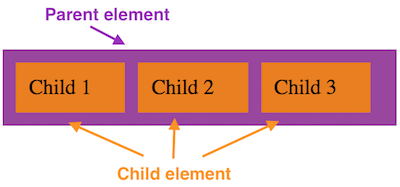
An example of a simple Flexbox layout. Additional margin included for illustration.
Further properties can then be used to modify the flow of the child elements within the flexbox, as well as the size and position of the individual child elements. For example, the following additional properties can be specified on the flex container (the flexbox itself—the parent):
justify-contentspecifies how the items should be spread out across the container if there is extra space. This can be easily used tocenterthe child elements—and if there is only a single child element, then that element will be centered in its parent. If the child elements’ width takes up the full span of the flexbox (so there is no extra space), then this property will have no visible effect.flex-wrapspecifies if items should “wrap around” to the next line when they overflow the container instead of shrinking to fit. This is similar behavior to what you see with text wrapping to the next line when it gets too long. Items that have wrapped will continue to have the same height as others on their “row”, and will be justified as specified
.my-flex-container {
  display: flex; /* make this element a flexbox */
  flex-wrap; /* wrap children to next line if larger than the container */
  justify-content: space-around; /* justify with equal space around the children */
}
For more information on other properties that can be used to customize a flexbox, see the MDN documentation or the Flexbox Guide.
You also can specify additional properties on the flex items (the immediate children of the flexbox) in order to adjust e.g., how much space of the flexbox they take up. These properties include:
flex-growspecifies what “share” or ratio of any extra space in the container the item should take up. That is, if the container is500pxwide, but the items only take up400pxof space, this property determines how much of the remaining100pxis given to the specific item.The value is a unitless number (e.g.,
1or2, defaulting to0), and the amount of remaining space is divided up proportionally among the items with aflex-grow. So an item withflex-grow:2will get twice as much of the remaining space as an item withflex-grow:1. If there are 4 items and100pxof space remaining, giving each itemflex-grow:1will cause each item to get25px(100/4) of the extra space. If one of the items hasflex-grow:2, then it will get40px(\(\frac{2}{1+1+1+2}=\frac{2}{5}=40\%\)) of the extra space, while the other three will only get20px.In practice, you can give each item a property
flex-grow:1to have them take up an equal amount of the remaining space in the container.There is an equivalent
flex-shrinkproperty that specifies the ratio an item should shrink to accommodate overflow space. This property doesn’t do anything when the items are in wrapping container (flex-wrap:wrap); and in practice, it is rarely used. It’s generally better practice to focus on elements at their smallest allowed size and give them space to grow, rather than worry about how they may shrink. The most common usage is to specify that an item should not shrink by giving it aflex-shrink:0.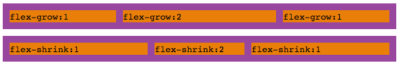
Top: visual example of
flex-grow. Bottom: visual example offlex-shrink. Notice how much extra “space” each item has after the text content.flex-basisallows you to specify the “initial” dimensions of a particular item. This has a similar effect to specifying thewidthproperty, except thatflex-basishas a higher priority and may be slightly more flexible. Note that likewidth, this value can be an dimensional measurement (absolute units like100px, or a relative unit like25%).In practice, using percentages for the
flex-basiswill let you easily size the columns of your layout.
There is also a shorthand property flex that allows you to specify three values at once: give the flex-grow, flex-shrink, and flex-basis values separated by spaces (the second two being optional if you want to use the default values). Note that if unspecified in the shorthand property, the flex-basis property will be set to 0, rather than the auto value it has if unspecified.
For more information on other properties that can be used to customize a flex item, see the MDN documentation or the Flexbox Guide.
While it may seem like a lot of options, it’s often enough to just use a basic flexbox (e.g., a <div> with display:flex). Adding such a container to “wrap” around content can help size the items and line them up horizontally. When using a flexbox, start by adding in the container, and then making small adjustments to achieve the effect you desire.
You don’t always need to use a flexbox for layout! If the normal flow sufficiees, then use that.
Resources
Many resources are linked in the text to describe particular properties. Some additional (or important!) general resources can be found below.
- CSS Reference (MDN) a complete alphabetical reference for all CSS concepts.
- Learn to style HTML using CSS (MDN)
- CSS Units and Values (MDN)
- The Code Side of Color
- CSS Tricks Flexbox Guide