Chapter 8 Responsive CSS
These days the majority of people accessing any web site you build will be using a device with a small screen, such as a mobile phone. But phones come in a wide range of sizes and resolutions, and many people will still access that same site from a laptop or desktop with a much larger monitor (as well as other capabilities, such as a mouse instead of a touchscreen). Different screens may require different visual appearances: for example, a three-column layout would be hard to read on a mobile phone! This poses and interesting design dilemma: how do you build one site that looks good and works well on both tiny phones and gigantic desktop monitors?
The modern solution to this problem is Responsive Web Design, which involves using CSS to specify flexible layouts that will adjust to the size of the display: content can be layed out one column on a small mobile screen, but three columns on a large desktop.
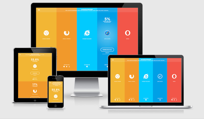
Example of a responsive web site on multiple devices, with content and layout changing at each size. From responsivedesign.is.
This chapter discusses CSS techniques used to create responsive web sites. These techniques underlie popular CSS frameworks, so it is important to understand them even if you rely on such tools.
8.1 Mobile-First Design
Responsive design is often framed as a technique to “make it also work on mobile”. This approach feels easy since websites are usually developed and tested on desktops, and follows from the software principle of graceful degradation (systems should maintain functionality as portions break down, such as the “capability” of having screen real estate).
But since websites are more likely to be visited on mobile devices, a better approach is to instead utilize mobile-first design. This is the idea that you should develop a website so it content and purpose is effectively presented on mobile devices (e.g., the most restricted in terms of screen size, capabilities, etc). Only once this base level of functionality is in place should you add features to make it also look good on larger devices such as desktops. This approach is also known as progressive enhancement: provide the core functionality, and then add “extra” features as more capabilities become available.
Rather than viewing mobile devices as “losing” features, look at desktops as “gaining” features! This will help you to focus on better supporting more common mobile devices.
Remember: working on your personal machine doesn’t ensure that it will work on anyone else’s!
A great way to test the responsiveness of your design is to click on the Toggle Device Toolbar icon in your element inspector:
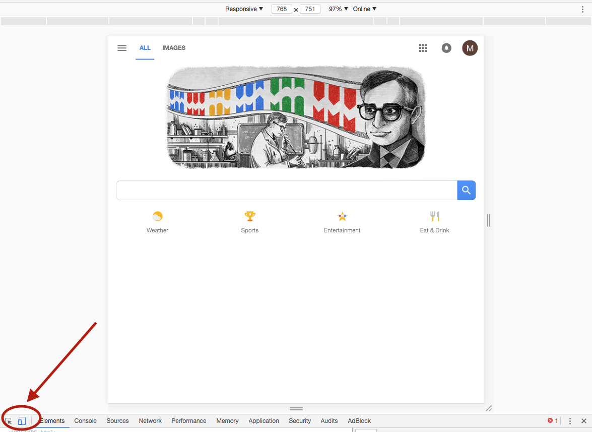
toggle device toolbar
This will allow you to specify a variety of different screensizes for specific devices of interest (i.e., an iPhone 5s, etc.).
Mobile-First Design Principles
While there is no magic formula for designing websites to support mobile devices, there are a few general principles you should follow:
Layout: On mobile devices, blocks of content should stack on top of each other, rather than sitting side by side in columns—mobile devices want to only scroll on one axis.
fixedcontent should be kept to a minimum, as it reduces the amount of scrollable screen real-estate.As you gain more screen space on desktops, you will want to break content up into columns or otherwise constrain its width so that it doesn’t stretch to ridiculous lengths; this helps with readability.
Media: Small screens don’t have enough space to necessitate very large, high-resolution images and video. Moreover, large images have large file sizes, and so will take a long time to download on slow mobile connections (not to mention eating away at limited data plans). Use compressed or lower-resolution images on mobile, and consider using background colors or linear gradient fills instead of background images. You can use higher-resolution media (and more of it!) on desktops, which usually have higher bandwidth available for downloading.
Page bloat is a real problem. You don’t need huge images… or possibly any images at all!Fonts: Make sure to use a large enough font that it is readable on small screens… but don’t make headings or callout text too large so that you lose that precious real estate! You can make them more styled and prominent on desktop, where there is room for such flourishes. Be sure to use relative units to accommodate mobile user preferences and screen size variation. Also remember that special web fonts you may be downloading will also take up extra bandwidth!
Navigation: Site navigation links take up a lot of room on small screens and may end up wrapping to multiple lines. Use small tab bars, or menu icons (e.g., the “hamburger icon”) to show complex menus on command. Most CSS frameworks provide some kind of collapsible navigation for mobile devices.
Input and Interaction: Tap/click targets need to be large-enough on mobile to select using a finger, especially for people with poor eyesight or thick fingers. Tiny icons placed right next to one another, or one-word hyperlinks are difficult to select accurately. Specifying a data type on form fields (e.g., email address, phone number, date, integer) also generates optimized on-screen keyboards, making data entry much easier.
Content: For some sites, you may even want to adjust what content is shown to mobile users as opposed to desktop users. For example, a phone number might become a large telephone icon with a
tel:hyperlink on mobile phones, but simply appear as a normal telephone number on desktop displays.
Specifying Viewport
Mobile web browsers will do some work on their own to adjust the web page in response to screen size—primarily by “shrinking” the content to fit. This often produces the effect of the website being “zoomed out” and the user enlarging the web page to a readable size and then scrolling around the page to view the content. While it may “work” it is not an ideal user interaction—this behavior can also interfere with attempts to be explicit about how webpages should adjust to the size of the screen.
To fix this, you need to specify the viewport size and scale by including an appropriate <meta> element in your HTML:
<head>
  <meta charset="utf-8"> <!-- always need this -->
  <meta name="viewport" content="width=device-width, initial-scale=1, shrink-to-fit=no">

  <!-- more head elements, including <link> ... -->
</head>
Including this element will keep the text size from adjusting to the browser’s width (though very narrow browsers may still shrink the text).
While not technically part of any web standard, the viewport meta element was introduced by Safari and is supported by most mobile browsers. The content attribute for the above meta tag sets 3 properties for mobile browsers: width (how big the viewport should be, specified to be the size of the device screen), initial-scale (how much to initially “zoom” the page, specified to be 1x or no zoom), and shrink-to-fit (tells Safari 9.0+ not to shrink the content to fit).
You should include the viewport meta tag in all of your responsive pages. Make it part of your default HTML template!
8.2 Media Queries
In order to define a webpage with a responsive appearance, you need to be able to conditionally change the applied style rules depending on the size of the screen (or browser window). We can conditionally apply CSS rules by using media queries. A media query is a bit like an if statement in CSS: it specifies a condition and the rules (selectors and properties) that should apply when that condition is true.
Media queries have syntax similar to the following:
/* A normal CSS rule, will apply to all screen sizes */
body {
    font-size: 14px;
}

/* A Media Query */
@media (min-width: 768px)
{
    /* these rules apply ONLY on screens 768px and wider */

    /* a normal CSS rule */
    body {
        font-size: 18px;
        background-color: beige;
    }
    /* another CSS rule */
    .mobile-call-icon {
        display: none; /* don't show on large displays */
    }
}
A media query is structurally similar to a normal CSS rule. The “selector” is written as @media, indicating that this is a media query not a normal CSS rule. The @media is then followed by a query expression, somewhat similar to the boolean expressions used in if statements. Expressions are written in parentheses, with the media feature to check, followed by a colon (:), followed by the value to check against. There are no relational operators (no > or <) in media queries, so you use media features with names such as min-width and max-width (to represent width > x and width < x respectively).
Media feature comparisons are not strict inequalities, so
min-width: 1000pxcan be read as “width greater than or equal to 1000px”.It is also possible to use the logical operators
andandnotto combine media feature checks. You can produce an “or” operator using a group selector (a comma,)./* style rules for screens between 768px and 992px */ @media (min-width: 768px) and (max-width: 992px) { } /* style rules for screens larger than 700px OR in landscape orientation */ @media (min-width: 700px), (orientation: landscape) { }
The @media rule is followed by a {} block, inside of which are listed further regular CSS rules. These rules will only be applied if the @media rule holds. If the @media rule does not apply, then these “inner” rules will be ignored. These “inner” rules can utilize all the selectors and properties value outside of media queries—think of them as mini “conditional” stylesheets!
You need to put full rules (including the selector!) inside of the media query’s body. You can’t just put a property, because the browser won’t know what elements to apply that property to.
Media queries follow the same ordering behavior as other CSS rules: the last rule on the page wins. In practice, this means that media queries can be used to specify conditional rules that will override more “general rules”. So in the example above, the page is set to have a font-size of 14px using a rule that will apply on any screens. However, on larger screens, the media query will also apply, overriding that property to instead make the default font size 18px.
Following a mobile-first approach, this means that your “normal” CSS should define the styling for a the page on a mobile device. Media queries can then be used to add successive sets of rules that will “replace” the mobile styling with properties specific to larger displays.
/* on small mobile devices, the header has a purple background */
header {
    font-size: 1.2rem;
    background-color: mediumpurple;
}

/* on 768px OR LARGER displays */
@media (min-width: 768px) {
    header {
        font-size: 1.5rem; /* make the header larger font on larger displays */
    }
}

/* on 992px OR LARGER displays */
@media (min-width: 992px) {
    header {
        background-image: url('../img/banner.png') /* use background image */
    }
}- In this example, the
<header>is given a simple purple background and default font size. When loaded on mobile devices, this is the only rule that applies (the media queries don’t apply to the given screensize), so that is all the styling that occurs. - But on devices
768pxor wider (like a tablet), the first media query is activated. This will then run a second rule that applies to the<header>, overriding the font to be larger (1.5rem)—it’s as if we had listed those twoheaderrules one after another, and the later one wins. But the first rule continues to apply, making the background purple. - Finally, a device
992pxor wider (like a desktop computer), will cause both of the media queries to execute. (since a device whose width is greater than992pxis ALSO greater than768px). Thus the<header>will be given a purple background and default font size, which will then be overridden to be a larger font by the first media query. The second media query will add an additional property (a banner image background), which will combine with the previous purple background (e.g., if the banner has any transparency). So on large displays, there will be a banner background on top of purple, with text in a larger (1.5rem) font.
This structure (starting with “default” mobile rules and then using media queries with increasingly larger min-width values) produces an effective mobile-first approach and clean way of organizing how the appearance will change as the screen gets larger. Note that while you can define as many media queries as you want, most professionals define only a few that match the common breakpoints between phone, tablet, and desktop screen widths. Since the media queries need to come after the mobile rules, they are often included at the end of the stylesheet—give all the mobile rules first, then all the media queries that modify them. (You can and should put multiple rules in each media query).
(Alternatively, it’s also reasonable to organize your stylesheets based on page “section”, with the mobile rules for that section given before the media queries for that section. E.g., after all your rules for creating the page header, put the media query with variations for desktop headers. Use whatever organization makes your code readable and maintainable, and leave plenty of comments to guide the reader!)
Example: Responsive Flexbox
As another example of using media queries to produce a responsive website, consider how they can combine with Flexbox to produce a single-column layout on mobile devices, but a multi-column layout on larger displays. Because a Flexbox layout is just a property applied to existing elements, we can effectively “turn on” the flex layout by using media queries.
Consider some simple HTML:
<div class="row">
  <div class="column">column ONE content</div>
  <div class="column">column TWO content</div>
  <div class="column">column THREE content</div>
  <div class="column">column FOUR content</div>
</div>
By default (without any style rules applied to the .row or .column classes), the four inner <div> elements (as block elements) will stack on top of each other. This is the behavior you want on mobile narrow screens, so now additional CSS or Flexbox usage is needed.
In order to turn these divs into columns on larger displays, introduce a media query that applies the flex layout to the .row (which acts as the container), thereby lining up the .column elements (which act as the items)
/* on devices 768px OR WIDER */
@media (min-width: 768px)
{
    .row { /* row becomes a flexbox container */
        display: flex;
    }

    .column  { /* column becomes a flexbox item */
        flex-grow: 1; /* make the columns grow equally to fill the row */
    }
}
You can also add an additional media query at another breakpoint so that the layout starts out stacked, then switches to two columns on medium-sized displays (leading to a two-by-two grid), and then switches to four columns on large displays:
/* on devices 768px OR WIDER */
@media (min-width: 768px)
{
    .row { /* row is a flexbox container */
        display: flex;
        flex-wrap: wrap; /* wrap extra items to the next "line" */
    }

    .column  { /* column is a flexbox item */
        flex-basis: 50%; /* columns take up 50% of parent by default */
        flex-grow: 1;
    }
}

@media (min-width: 1200px) {
    .column {
        flex-basis: auto; /* columns are automatically sized based on content */
    }
}
In this case, the first media query (768px + or medium-sized displays) applies the flex layout and specifies that the items should wrap if they overflow the container… which they will, since each item has a default flex-basis size of 50% of the container. This will cause each of the 4 items to take up 50% of the parent, wrapping around to the next line.
Then when the screen is larger (1200px + or large-size displays), the second media query is applied and overrides the flex-basis so that it will automatically calculate based on the content size, rather than being 50% of the parent. That way as long as the columns fit within the parent, they will all line up in a row (they have the flex-grow property to make them equally spread out).
The best way to get a feel for how this works is to see it in action: see this CodePen for an example of the above behavior—resize the browser and watch the layout change!
Media rules are a powerful and declarative way to create a single page that looks great on everything from a small mobile touchscreen to a large desktop monitor with a mouse, and form the foundation for responsive CSS frameworks that can help you easily create fantastic looking pages.